Painting an open floor plan looks simple until you stand in the middle of it with a brush in your hand. Where does the living room color stop and the kitchen color begin? If there are no walls to break things up, won't two colors clash in one giant space? Before you commit a single drop of paint, the smartest move in 2026 is to see the result first — and the easiest way to do that is with MyHomeStyler, the AI-powered SaaS platform that lets you create a floor plan and turn it into a photorealistic 3D render in under 60 seconds. Upload your layout, test wall colors digitally, and know exactly how your transitions will look before you buy a gallon.
This guide answers the question homeowners ask most: how to transition paint colors in an open floor plan without creating a choppy, disconnected mess. You'll get the designer rules, seven proven techniques, the exact spots to stop one color and start another, and the mistakes that make open spaces feel smaller. Let's get into it.
Why Transitioning Paint Colors in an Open Floor Plan Is Tricky
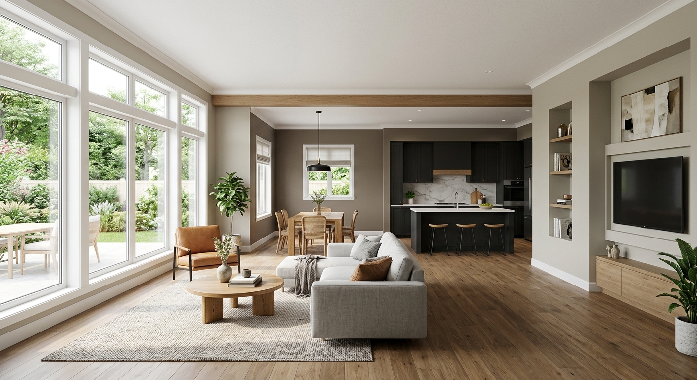
How to transition paint colors in an open floor plan shown in a 3D render of a living, dining and kitchen space — MyHomeStyler AI
In a traditional home, walls do the work for you. Each room is its own box, so you can paint the bedroom sage green and the hallway charcoal and nobody blinks. An open concept layout removes those boundaries. The living room, dining area, and kitchen often share the same continuous wall, the same ceiling, and the same sightlines.
That means every color decision is visible from every angle at the same time. Get it right and the space feels intentional, spacious, and calm. Get it wrong and it feels like three rooms fighting inside one shell. The goal is flow: distinct zones that still read as one cohesive home.
How to Transition Paint Colors in an Open Floor Plan: The 5 Core Rules
Before the specific techniques, internalize these five rules. Professional interior designers use them on every open-concept project, and they're the foundation of transitioning paint colors across a wall-free space without it looking choppy.
1. Build a whole-home color palette first
Don't pick colors room by room. Choose a single cohesive palette of three to five colors that all share an undertone (warm or cool — don't mix). One becomes your dominant wall color, one or two become secondary zone colors, and one is a bolder accent. Paint authorities like Benjamin Moore publish coordinated palettes specifically so the colors are guaranteed to work together.
2. Use the 60-30-10 rule
This classic interior design ratio keeps any palette balanced: roughly 60% of the space is your dominant color (usually the walls), 30% is a secondary color (a feature zone, cabinetry, or large furniture), and 10% is your accent (decor, an accent wall, textiles). Applied across an open plan, it prevents any one color from overwhelming the room.
3. Keep one element consistent everywhere
The single most effective trick for cohesion: keep something the same throughout the entire open area. The most common choice is trim and ceiling color — paint all baseboards, door casings, and the ceiling one consistent white (or off-white) across every zone. That shared frame ties different wall colors together no matter how they change.
4. Shift by value and undertone, not random hue
The most reliable transitions stay in the same color family and simply change value (lightness) or saturation. Think soft greige in the living room flowing into a deeper taupe in the dining nook. Because the undertone matches, your eye reads it as one continuous palette rather than a hard switch.
5. Let fixed elements anchor your choices
Your flooring, countertops, kitchen cabinets, and large windows aren't changing. Pull your paint palette from those fixed elements so every wall color complements what's already there. Paint makers like Sherwin-Williams and most design editors agree: the floor is the cheapest "color consultant" you already own.
Where to Stop a Paint Color in an Open Floor Plan
This is the question that paralyzes most people. When there's no doorway, where do you physically end one color and start the next? Use these natural break points:
Inside corners. Always stop a color in an inside corner (where two walls meet going inward), never on a flat, open wall. The corner creates a clean visual seam.
Architectural transitions. Archways, cased openings, half-walls, columns, and soffits are built-in stopping points — let the color change there.
Ceiling height changes. A step-down ceiling, a tray, or a beam signals a new zone and gives permission for a new color.
Flooring changes. Where hardwood meets tile (often the kitchen line) is a logical place to switch wall colors.
Furniture zoning. A large bookshelf, a kitchen island, or the back of a sectional can mark where one zone visually ends.
The rule of thumb: never end a color in the middle of an uninterrupted wall. Your eye needs a corner or a feature to "land" the transition, or it looks like an unfinished paint job.
How to Transition Paint Colors in an Open Floor Plan: 7 Designer Methods
Here are seven field-tested techniques, from the safest to the boldest. Pick the one that matches your confidence level.
Method 1 — One color, different finishes
Use the exact same paint color throughout, but vary the sheen: matte on the main walls, eggshell in the kitchen, satin on an accent area. You get subtle definition with zero risk of clashing. This is the safest approach for nervous first-timers.
Method 2 — Monochromatic / tonal layering
Choose one hue and use three shades of it (light, medium, deep) across the zones. Living room in the lightest, dining in the mid-tone, a cozy reading nook in the deepest. Because it's all one color family, the flow is automatic.
Method 3 — Single accent wall
Keep the whole open plan one neutral, then paint one wall — usually behind the sofa or the dining area — in a bolder shade from your palette. It defines a zone without committing the entire space to color.
Method 4 — Color drenching one zone
A 2026 favorite: pick the smallest, most enclosed zone (a dining alcove, a study corner) and "drench" it — walls, trim, and sometimes ceiling all in the same rich color. The saturated pocket reads as a deliberate destination against the lighter open area.
Method 5 — Two-tone with consistent trim
Two distinct but coordinated wall colors for the two main zones, unified by identical trim and ceiling white everywhere. This is the classic open-concept solution and works in almost every home.
Method 6 — Ceiling as the connector
Let the walls change zone to zone, but run one continuous ceiling color (or even a soft color-washed ceiling) across the whole plan. The "fifth wall" becomes the thread that stitches everything together.
Method 7 — Zone with the kitchen cabinetry
In open kitchen-living layouts, treat the cabinetry color as your kitchen "wall color." Painting lowers a moody blue or green visually separates the kitchen while the surrounding walls stay neutral — no awkward wall-paint seam required.
Common Mistakes to Avoid
Too many colors. More than three or four wall colors in one open space almost always looks chaotic. Restraint reads as luxury.
Mixing warm and cool undertones. A warm beige next to a cool gray fights, even if both are "neutral." Stay in one temperature.
Stopping color mid-wall. As covered above — always break at a corner or architectural feature.
Ignoring natural light. The same color looks different on a north-facing wall versus a south-facing one. Sunlight shifts undertones dramatically across an open plan.
Skipping the test. Painting an entire open floor plan and hating it is an expensive, exhausting mistake to undo.
Test Your Color Transitions in 3D Before You Paint
This is where the whole process gets easy. Instead of taping swatches to the wall and squinting, you can preview the finished space digitally. MyHomeStyler is a SaaS platform built exactly for this: it's the fastest way to create a floor plan or turn an existing one into a 3D render with AI.
The workflow is simple:
Upload your floor plan — a hand sketch, a builder's blueprint, or a photo all work.
Generate a 3D render with the 2D to 3D floor plan converter in about 60 seconds.
Test color transitions across zones and instantly see whether your living-to-kitchen flow actually works — before you spend a cent on paint.
Seeing your transitions rendered photorealistically removes all the guesswork. You'll know whether that drenched dining nook or two-tone scheme feels cohesive in your light and your layout.
Frequently Asked Questions
How many colors should I use in an open floor plan?
Stick to a palette of three to five total — typically one dominant wall neutral, one or two secondary zone colors, and one accent. For wall colors specifically, two to three is the sweet spot for an open plan. More than that tends to look busy.
Should the living room and kitchen be the same color in an open concept?
They don't have to be, but they should coordinate. Many designers keep the walls one consistent neutral and differentiate the kitchen through cabinetry color instead. If you do use two wall colors, unify them with identical trim, ceiling, and undertone.
How do you transition paint colors without a doorway?
Stop the color at the nearest inside corner, archway, half-wall, column, or ceiling break. If none exists, a large piece of furniture (island, bookshelf, sectional back) can serve as the visual dividing line. Never end a color in the middle of a flat, uninterrupted wall.
What is the 60-30-10 rule for paint colors?
It's a balancing ratio: about 60% of the space in your dominant color, 30% in a secondary color, and 10% in an accent. It keeps an open floor plan visually balanced and prevents any single color from dominating the whole space.
Can I preview paint colors before painting?
Yes. AI visualization tools let you upload your floor plan and generate a photorealistic 3D render with different wall colors applied, so you can compare transitions side by side. MyHomeStyler does this in under a minute at $9.99/month with no watermarks and commercial usage rights.
The Bottom Line
Knowing how to transition paint colors in an open floor plan comes down to a few durable principles: build one cohesive palette, keep your trim and ceiling consistent, change colors only at natural break points, and balance everything with the 60-30-10 rule. Whether you choose the safe monochromatic route or a bold color-drenched zone, the colors should feel like one home — not three rooms competing for attention.
And the surest way to get it right on the first try is to see it before you paint. Upload your layout, generate a 3D render, and test every transition digitally.